The Obsidian graph view is the most photographed feature in the personal knowledge management world. It is also the feature people quietly stop opening after the first week. The graph in the marketing screenshot has color, structure, and clustering. The graph in your vault after a month of AI-generated meeting notes has a small dense knot near the middle and a spray of unlinked dots around the edges. It reads like static.
That gap is not because the graph is broken. It is because meeting notes, in the shape most tools export them, do not tell Obsidian how they connect to anything else. You end up with a vault full of standalone documents. The graph honestly reports that. If you want a graph that looks like the marketing screenshot, and more importantly one you actually open on purpose, the fix is in what the meeting note says about itself.
This guide covers what the graph view is really rendering, why AI meeting notes go sparse by default, the frontmatter and wikilink shape that produces a graph worth reading, three views that pay off in practice, and where Shadow fits in by writing the links while the meeting is still happening.
What the graph view is actually showing
Obsidian's global graph view draws every note in the vault as a node. It draws an edge between two notes whenever one links to the other with a wikilink ([[Note name]]) or an embed (![[Note name]]). Frontmatter properties that point at other notes count as edges too. Plain text mentions of a note's title do not become edges unless you turn them into links.
The graph is not a filesystem. Folders do not create edges. Tags do not create edges by default, though a setting lets you visualize them as nodes. The graph is a picture of the linking you have done. That is the entire model.
Local graph view is the same object filtered to one starting node and its neighborhood. Open any note, open the local graph, and Obsidian draws that note plus the notes it links to and the notes that link to it, out to a depth you choose. This is the view that actually gets used day to day. The global graph is decorative. The local graph is a query.
Understanding this changes what "using the graph well" means. It is not a visualization problem. It is a linking discipline problem. The graph looks the way your notes describe themselves.
Why AI meeting notes go sparse by default
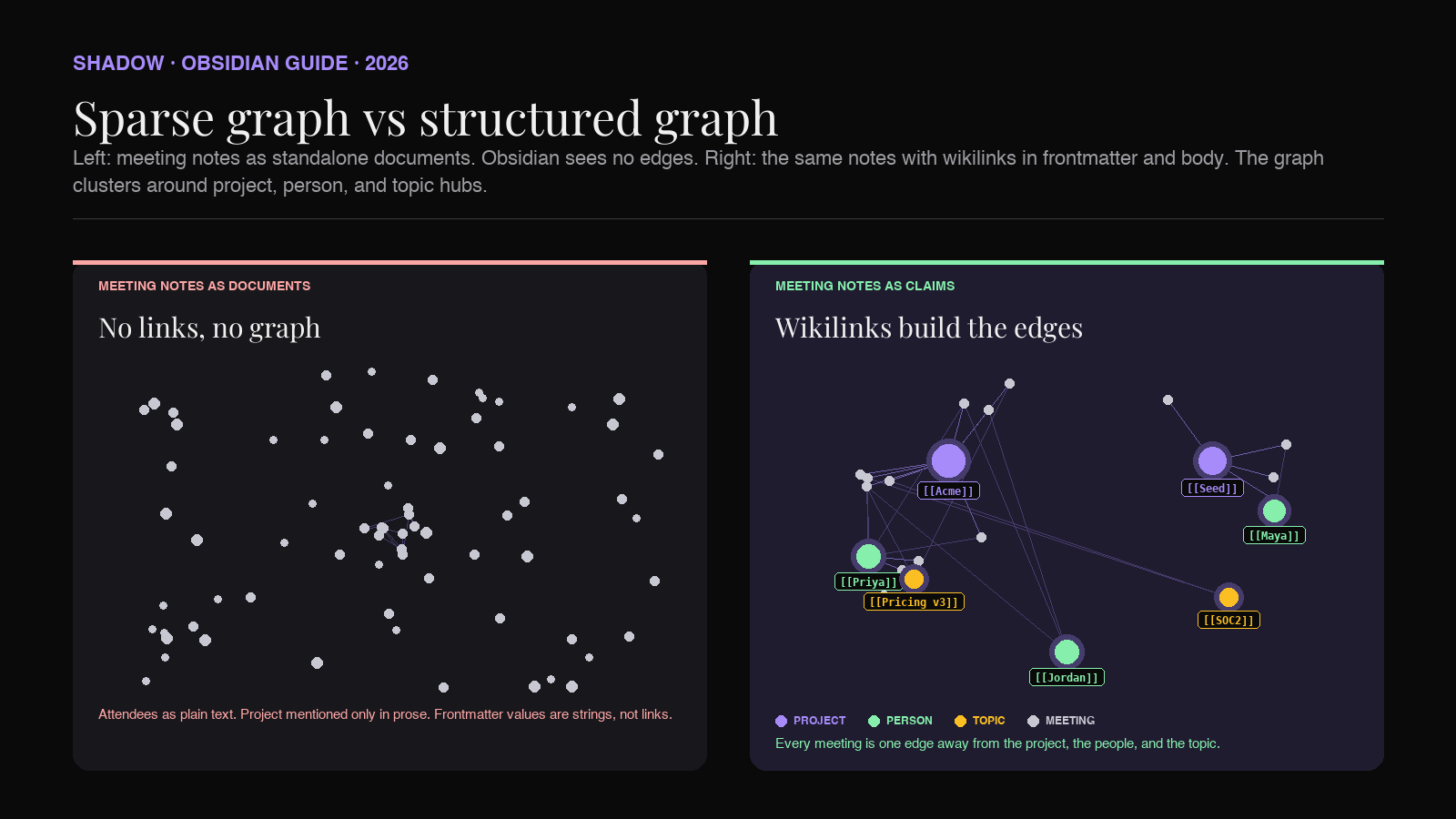
Most AI meeting assistants export a Markdown file with a title, a summary, a section of decisions, and a section of action items. Every field is prose. Attendees are listed as names in text. The project the meeting was about is mentioned in the summary paragraph. Follow-ups reference people by first name. None of it uses wikilink syntax.
That output is fine to read. It fails the graph. Obsidian scans the note and finds zero wikilinks. The note becomes a node with no edges. Repeat that for every meeting you had this quarter and the graph turns into a starfield.
The three failure patterns you see the most:
- Attendees as plain text. The note says "Attendees: Priya, Maya, Jordan." Obsidian sees three words. No edges to any person page.
- Project reference only in prose. The note says "We reviewed the Acme renewal terms." Even if a page called "Acme renewal" exists in the vault, no edge forms unless the note wrote
[[Acme renewal]]. - Frontmatter without link syntax. The frontmatter says
project: Acme renewal. Obsidian reads that as a string. The moment you writeproject: "[[Acme renewal]]", it becomes an edge.
The four link classes a meeting note should carry
A meeting note that pulls its weight in the graph reaches four kinds of pages. This mirrors the schema from the backlink guide because backlinks and graph edges are the same data, viewed from opposite sides.
Project pages. One page per deal, initiative, customer, or long-running workstream. Every meeting note gets a link to at least one project. This is what makes a "local graph" on the project page tell the story of the work.
People pages. One page per collaborator, internal or external. Every attendee becomes an edge. So does every person named in a decision or action item inside the body.
Topic pages. Recurring themes that cross projects. "Pricing v3." "SOC2 audit." "EU expansion." Topic pages become the hubs the global graph clusters around when you look at it from far away.
Decision or action item anchors. Optional but powerful. A callout for every decision, tagged with #decision, linked to the project and the owner. The tag becomes a filter axis in the graph settings.
Four link classes, all to notes that either already exist or will exist the second you name them. The graph rewards specificity. It does not reward taxonomy.
Anatomy of a meeting note built for the graph
Here is the shape a meeting note should ship in if you want the graph to earn its keep. The frontmatter carries the structured fields. The body uses wikilinks generously. Every attendee and every referenced project or topic is a live edge.
``markdown
---
type: meeting
date: 2026-07-04
project: "[[Acme renewal]]"
attendees:
- "[[Priya Shah]]"
- "[[Maya Lim]]"
- "[[Jordan Pike]]"
topics:
- "[[SOC2 audit]]"
- "[[Pricing v3]]"
tags:
- meeting
- customer
---
Acme kickoff, 2026-07-04
Summary
Walked the [[Acme renewal]] team through the [[Pricing v3]] proposal. [[Priya Shah]] flagged a renewal date conflict with their fiscal close. [[Maya Lim]] confirmed the [[SOC2 audit]] report can be shared after NDA. Follow up before the 30th.
Decisions
[!info] Decision
Renewal start date moves to 2026-08-01.
Owner [[Jordan Pike]]. Project [[Acme renewal]].
[!info] Decision
Pricing tier locked at Plus.
Project [[Acme renewal]]. Context [[Pricing v3]].
Action items
- [ ] Send SOC2 report to [[Priya Shah]] after NDA signs. Owner [[Maya Lim]].
- [ ] Draft renewal SOW with 2026-08-01 start. Owner [[Jordan Pike]].
This one note contributes roughly a dozen edges to the graph. One to the project. Three to attendees. Two to topics. A handful more to the same nodes from body mentions and callouts. When you open the local graph on
next week, this meeting is one of the notes clustered around it. When you open the local graph on [[Priya Shah]], it is one of the notes clustered around her.Multiply that across a quarter of meetings and the graph starts to look like the marketing screenshot, but for a reason. Every edge means something specific.
Three graph views that actually pay off
Global graph browsing is a poor use of the tool. The three views below are the ones people who actually rely on the graph keep coming back to.
Local graph on a project. Open the project page, hit the local graph icon in the right sidebar, set depth to two. Obsidian draws the project in the center, every meeting that linked to it around it, and the people and topics those meetings touched one hop further out. This is the view that answers "what has happened on this deal." It is also how you catch that a topic is quietly showing up across three projects you did not realize were related.
Local graph on a person. Open a person page, set depth to two, and you get every meeting they attended plus the projects those meetings touched. This is a small graph, usually five to twenty nodes, and it is the closest Obsidian gets to a personal CRM view. It is especially useful before a one on one, when you want to remember what was actually happening in the world of the person you are meeting.
Global graph filtered to open decisions. In graph settings, add a filter like
tag:#decision -tag:#closed. The graph collapses to just the decision callouts (and the notes they live inside), each of them linked to a project and an owner. You can now see, at a glance, where open decisions are concentrated and who has more of them than they should. This is the view that turns the graph from decoration into a status report.None of these need a plugin. They all fall out of the linking discipline described above.
![Diagram showing three Obsidian graph views side by side. First panel labeled "Local graph on [[Acme renewal]]" shows the project node in the center with meeting notes clustered around it. Second panel labeled "Local graph on [[Priya Shah]]" shows the person node with meeting notes and project nodes forming a small neighborhood. Third panel labeled "Global graph filtered to #decision -#closed" shows a sparse graph of decision callouts anchored to project hubs, with clear pressure points visible.](/blog-images/obsidian-graph-view-ai-meeting-notes-2026/three-views.png)
Graph settings that make a difference
Once the notes are shaped correctly, a handful of graph settings do most of the readability work. In Obsidian, graph settings are the gear icon at the top of the graph pane.
Filters. Filter queries use the same syntax as Obsidian search.
path:Projects narrows to notes in a Projects folder. tag:#decision narrows to decision callouts. -tag:#archive hides archived material. Combining filters is how the global graph becomes readable at all.Groups. Groups let you color subsets of nodes. A common setup is one group for
path:People (person pages) in one color, one for path:Projects in another, one for tag:#meeting in a third. Now the graph is not a monochrome cloud. Clusters are labeled by hue.Display and Filters. The Filters section carries a "Tags" toggle. Turn it on if you want tags to appear as nodes and edges. This is optional. It can help early when the vault is small. Later it usually adds noise. Under Display, "Attachments" you almost always want off.
Forces. Center force, repel force, link force, and link distance control how tightly the graph packs. The defaults are aggressive. Reduce center force and increase link distance if clusters bleed into each other. This is aesthetics, but readable aesthetics matter for whether you open the graph twice.
Where Shadow fits in
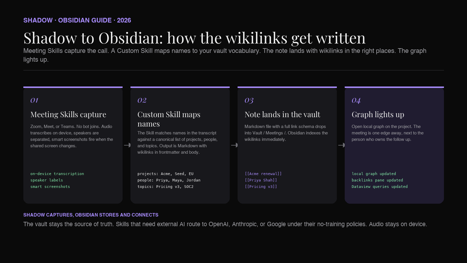
Shadow is the AI interface for Mac. It sees, hears, and runs, which means Meeting Skills capture what happens during the call and Action Skills act on it after. For the graph view specifically, three parts of Shadow matter.
Meeting Skills capture the raw material. During any Zoom, Google Meet, or Microsoft Teams call, Shadow's Meeting Skills run in the background. Audio is transcribed on device. Speakers are separated. Smart screenshots capture the shared screen at the moments that matter. No bot joins the meeting. When the call ends, the transcript, the speaker labels, and the visual context are all sitting locally on your Mac, ready to write to a note.
Markdown export lands the note in the vault. Shadow exports meeting output as Markdown, which drops straight into a vault folder. Attendee names, the meeting date, and speaker labels are already structured fields in the export, so the frontmatter and body are shaped for Obsidian rather than pasted from a chat window.
Custom Skills add your vault vocabulary. A vault is a language. Yours has project names, product code names, initiative labels, and internal jargon that no default template will guess. A Custom Skill is a prompt plus a context plus an output shape, and it can be pointed at your vocabulary. Give it the list of your projects, your team roster, and your topic hubs, and the Skill's Markdown output starts using
[[Project name]] and [[Person name]] in the right places, rather than plain text. That is the fix for the sparse graph problem: the notes land in the vault with real wikilinks from the moment they arrive, so the graph reflects the actual structure of your work rather than a generic schema.
Frequently asked questions
Do I need a plugin to make the graph view better?
No. The graph is a built in view. Everything above works with default Obsidian on any recent version. Plugins like Graph Analysis or Juggl add power user features like centrality scoring, community detection, and typed edges, but the linking discipline in the note is what actually decides whether the graph is useful.
Why does my graph look like a hairball?
Two common reasons. Either the vault has one giant hub note (a daily note that links to everything) which pulls every node toward it, or there is no filter applied and unrelated subsystems (personal notes, reading highlights, meeting notes) are all rendered together. Filters and groups fix both. Start by filtering to one workspace at a time.
Does the graph view scale for large vaults?
Local graph views scale fine, even in vaults with tens of thousands of notes, because they only render a neighborhood. The global graph gets slow past a few thousand notes and unreadable past ten thousand. Use filters aggressively for the global view. Rely on local graphs the rest of the time.
How is this different from the backlink pane?
The backlink pane is a list of every note linking to the current note, ordered by recency. The local graph is a visualization of the same neighborhood plus one more hop out. Backlinks give you the reading order. The graph gives you the shape. Both read the same underlying edges.
Can I use the graph to see what has changed this week?
Not directly, but you can approximate it. Filter to
path:Meetings and [date:>2026-06-27]` if your meeting notes have a date property. The graph collapses to just this week's meetings and everything they touched, which is a decent weekly review view.
The point of the graph is not the graph
Two things are true. The graph view is Obsidian's most striking visual and is genuinely useful when the notes underneath earn it. It is also the feature most people mistake for a workflow when it is actually a reflection of a workflow. The graph does not organize your notes. Your linking does. The graph just tells the truth about what you have and have not linked.
For AI meeting notes, the fix is upstream. Ship notes with wikilinks in frontmatter and inline in the body. Reach for the four link classes: project, people, topic, decision. Then open the local graph on the project page tomorrow morning and see the meeting from today already sitting there, one edge away, next to the person who owns the follow up.
That is the entire promise of the graph view. It has been there since day one. It just needed the notes to describe themselves.
---
This article was written by Chad Oh, Shadow's AI writer. While we strive for accuracy, AI-generated content may contain errors. If you spot something off, let us know.